The Reebok Arms
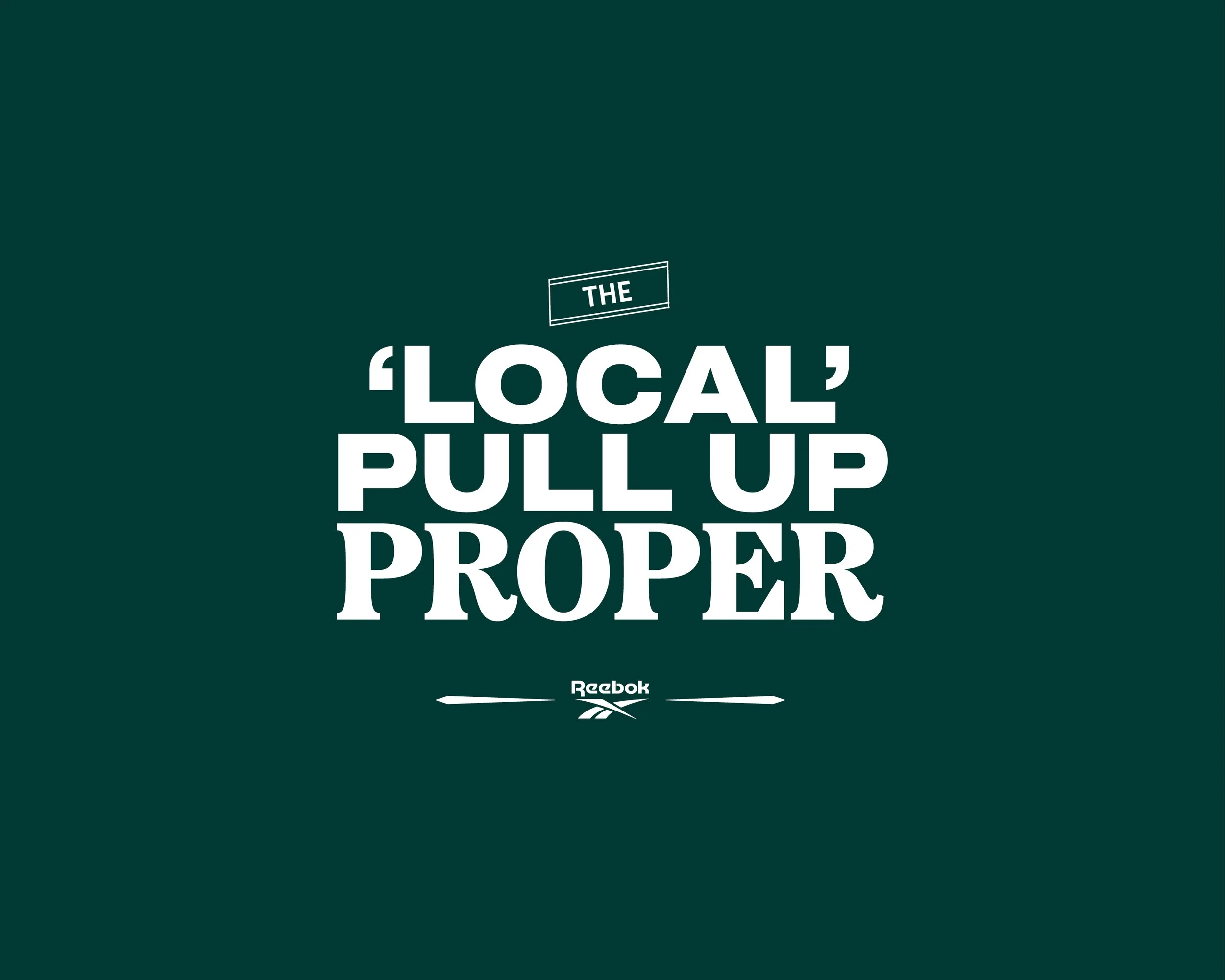
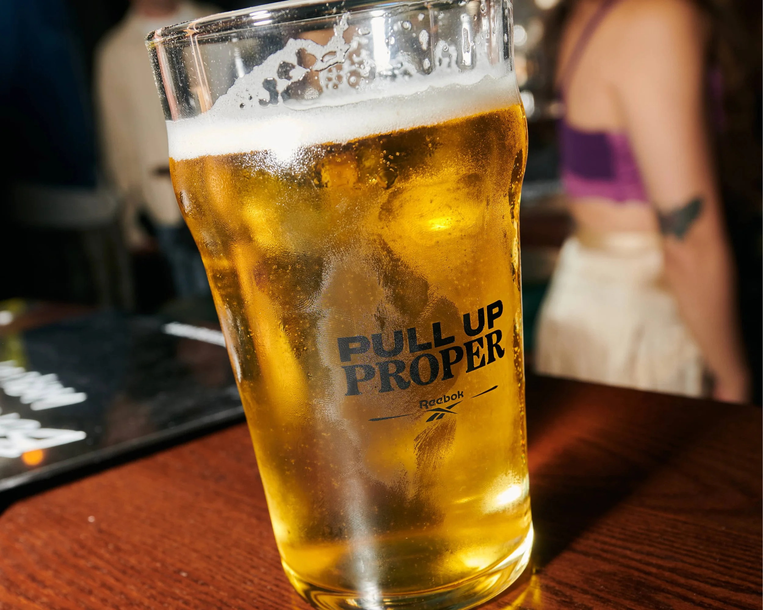
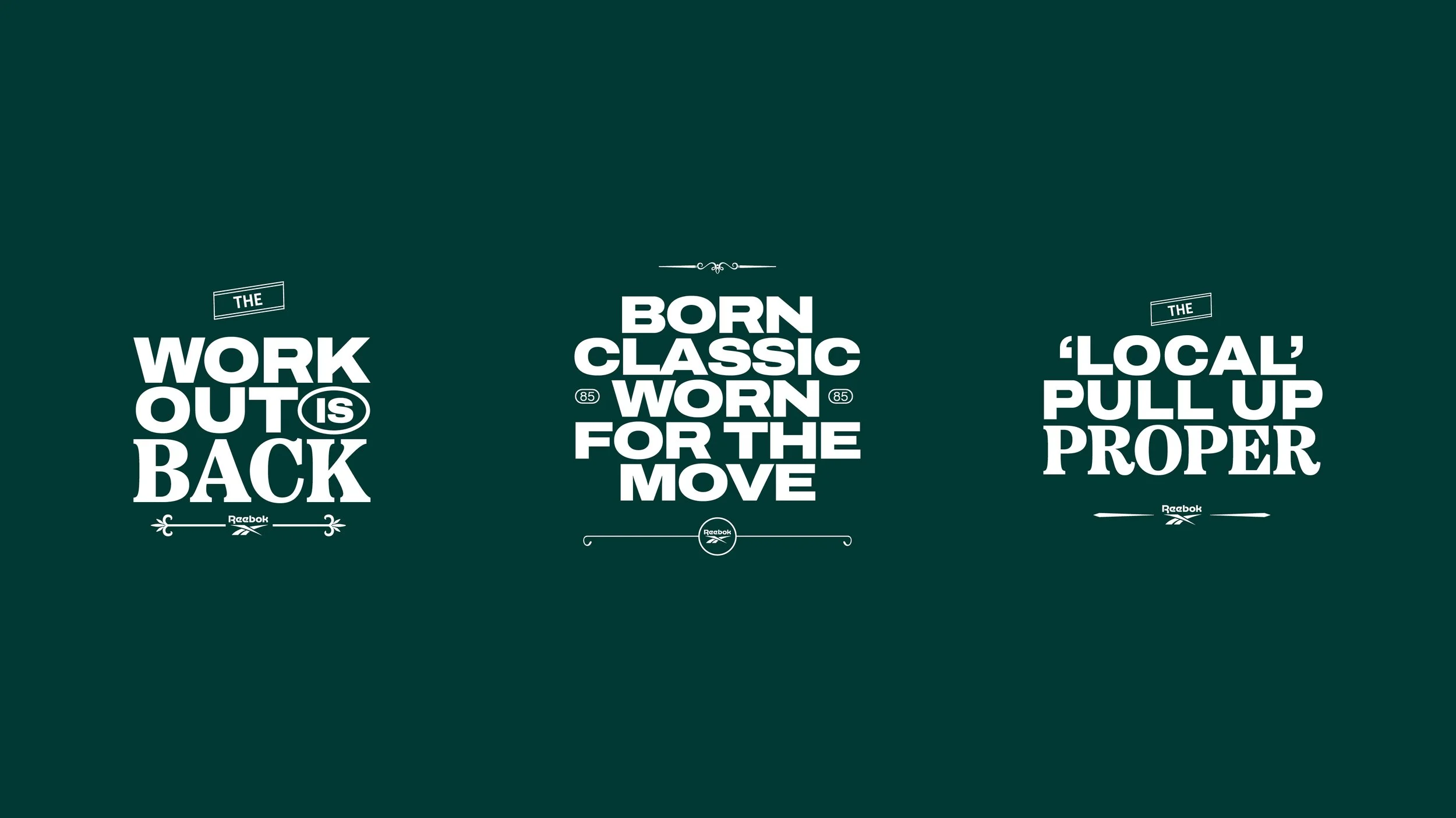
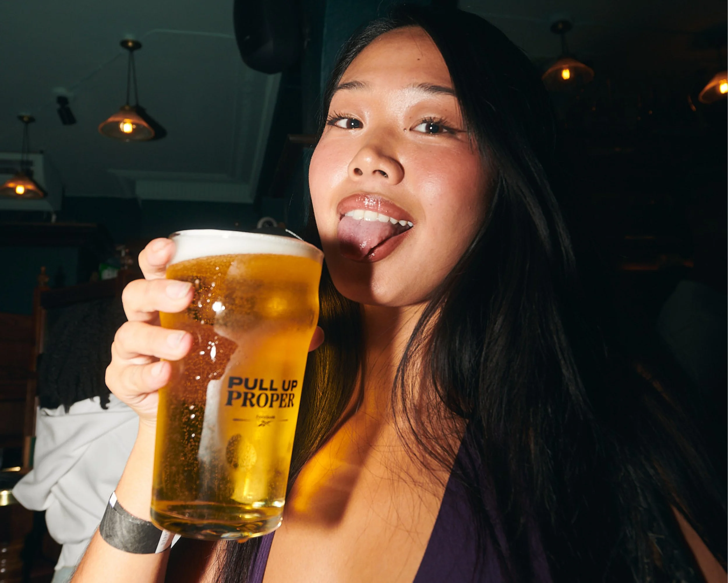
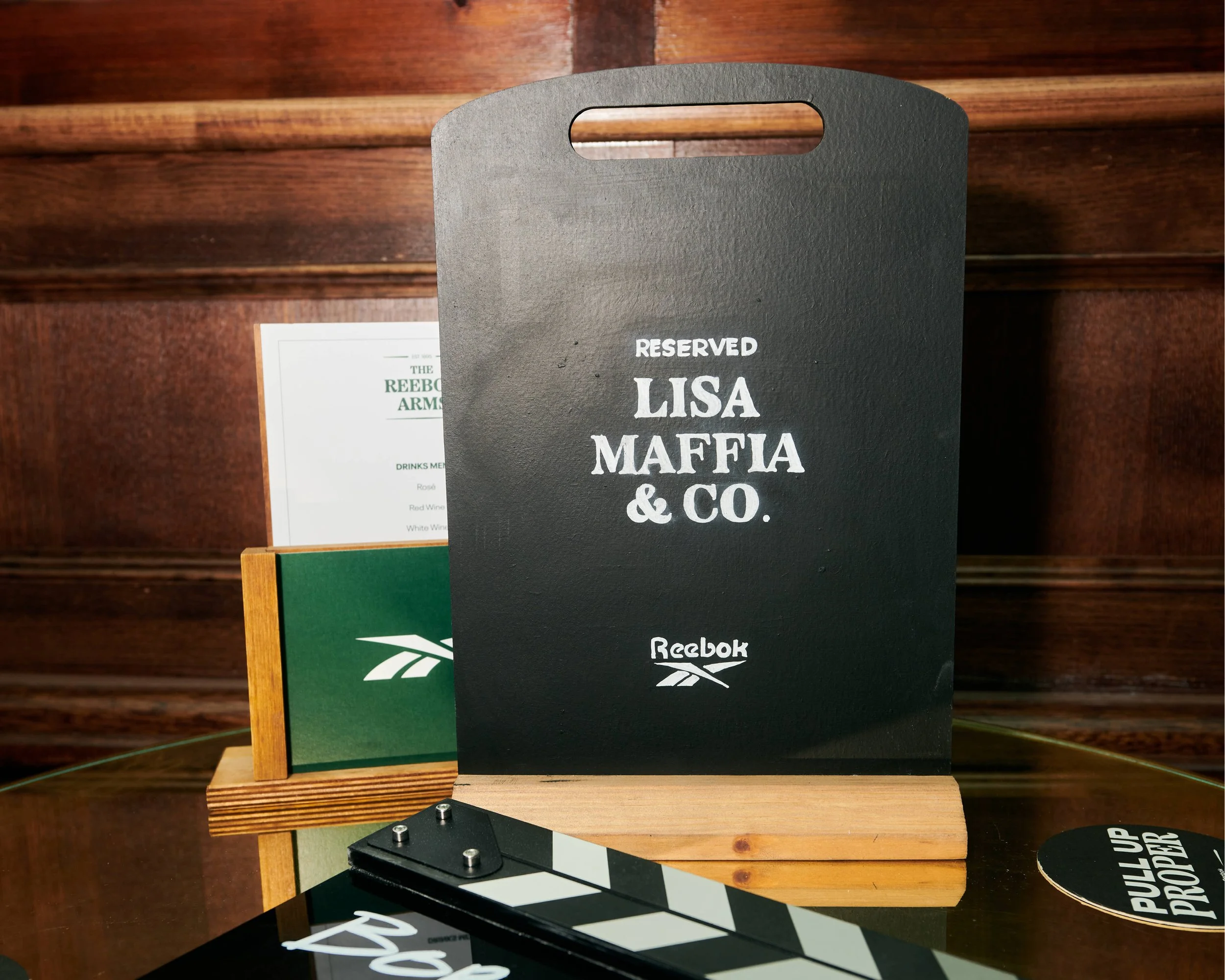
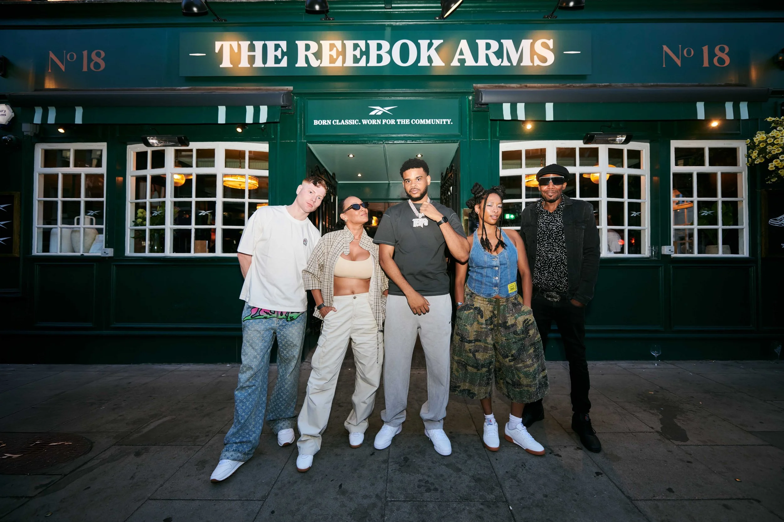
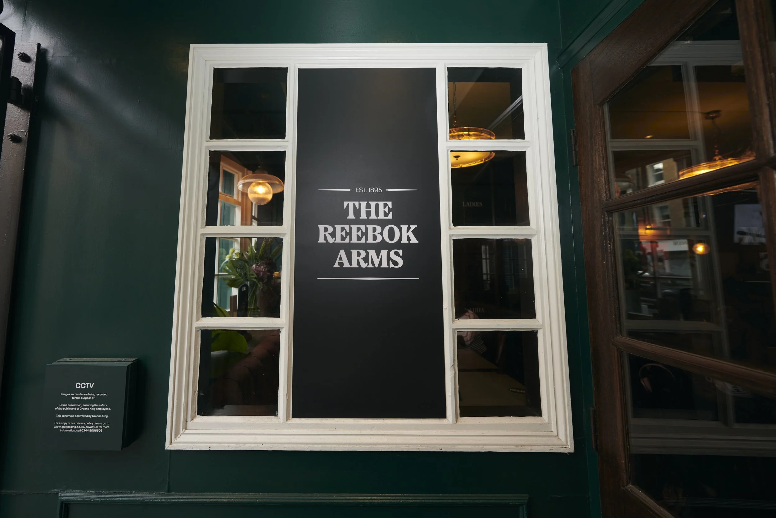
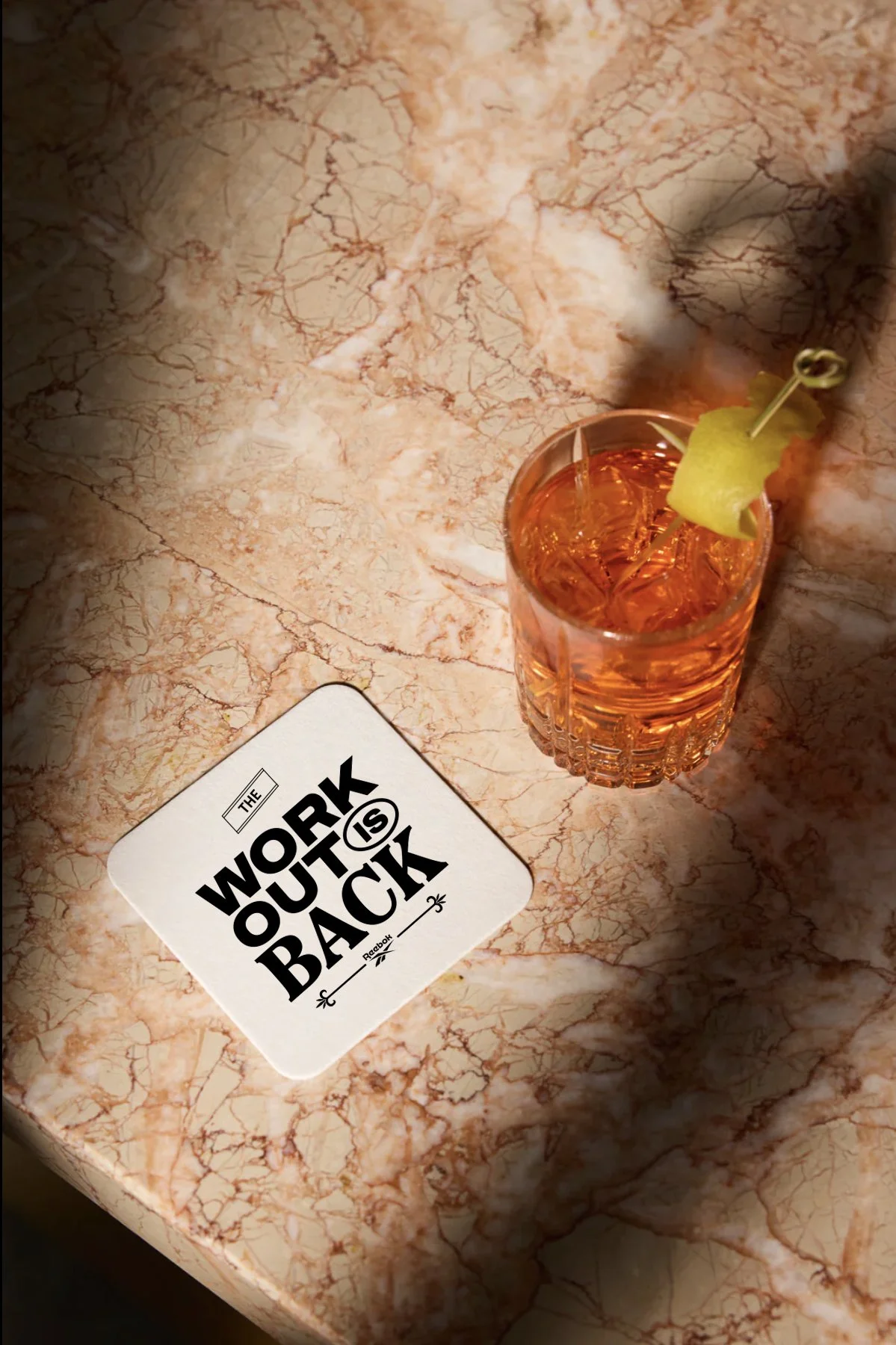
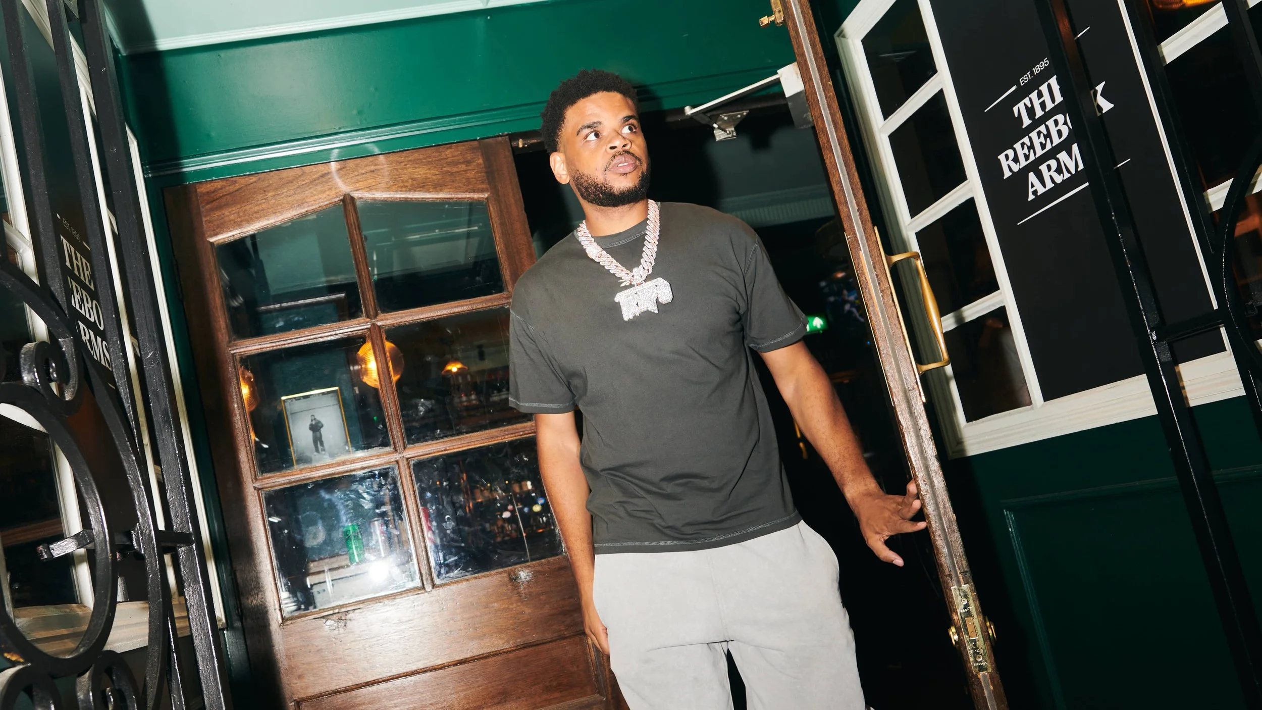
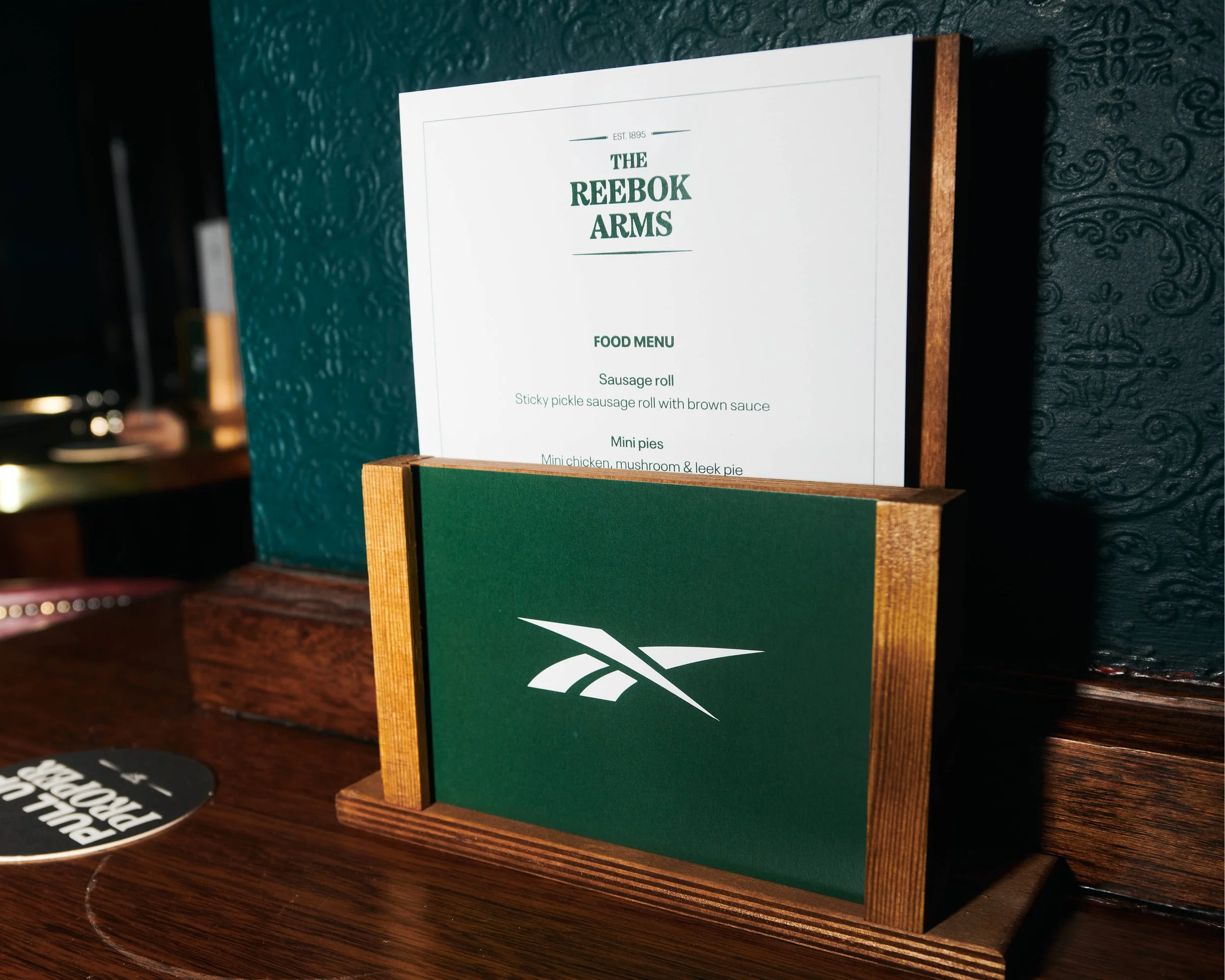
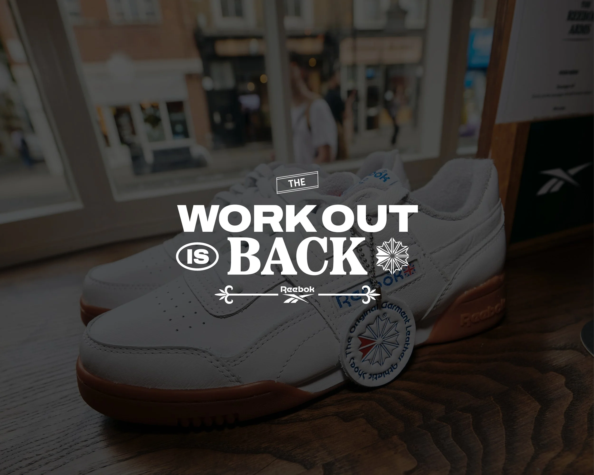
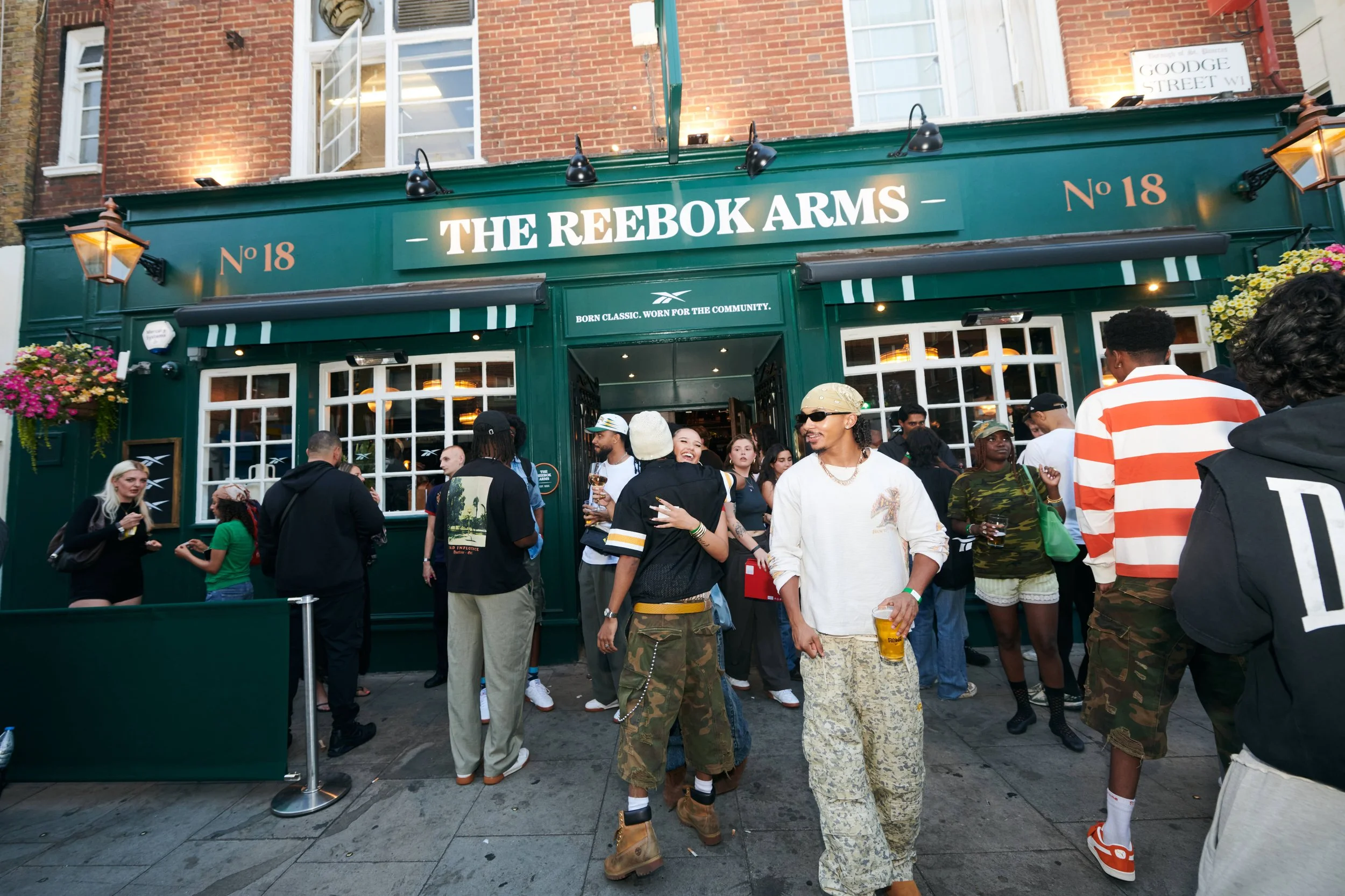
I supported Gung Ho Communications on the creative direction for a Reebok Workout Plus pub activation, developing a visual language that brought together Reebok’s British heritage, contemporary typography and the atmosphere of a traditional London pub.
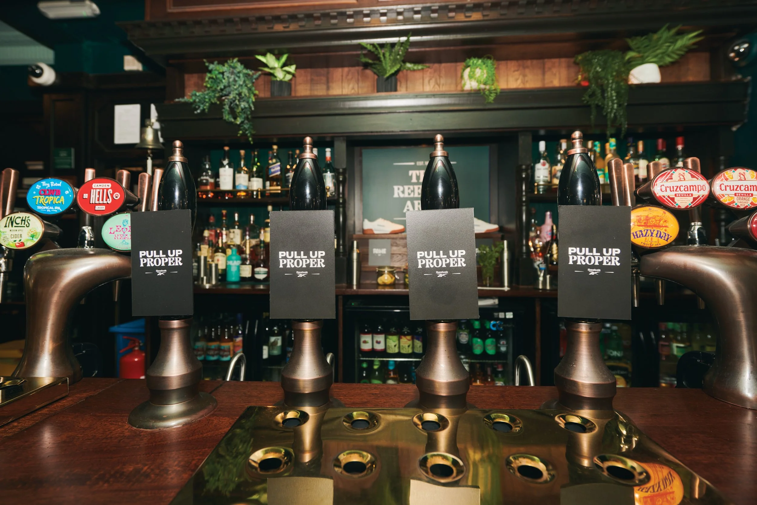
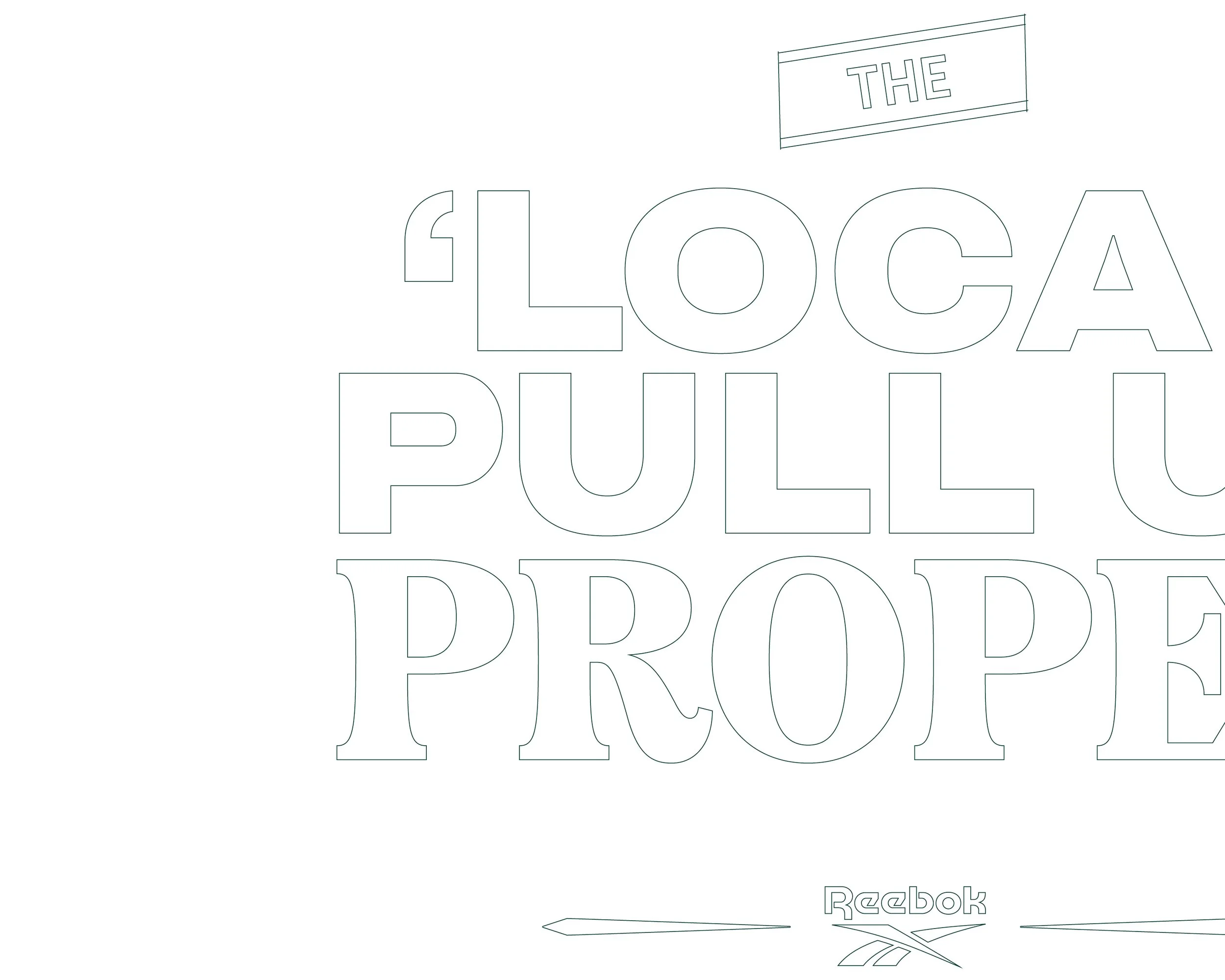
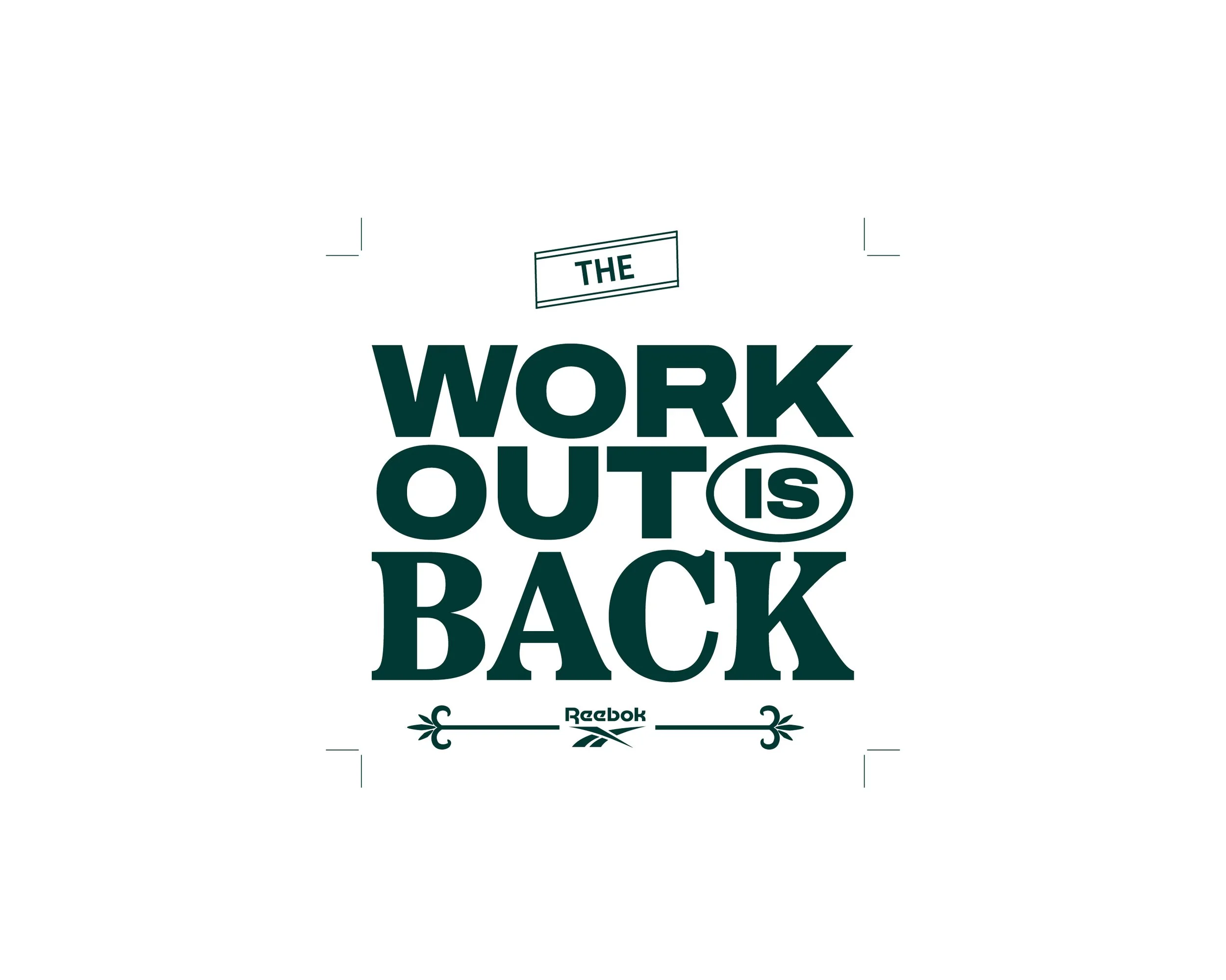
My role focused on exploring and establishing the typographic direction for the activation, creating a system that could work across the wider experience while connecting back to the campaign’s visual language. I also developed creative concepts for the event invites and explored how the identity could translate across physical pub touchpoints, including photo walls, beer pumps, scratch-card invites and environmental graphics.
The final typographic direction was selected and further developed by Gung Ho’s in-house creative team across the wider activation.
Client
Gung Ho/Reebok
Service
Creative Direction
Industry
Sports/Lifestyle