Croatia's Checkerboard: The Symbol Behind a Nation's Visual Identity
There's a moment when you're travelling somewhere new where a detail just keeps following you around. In Croatia, that detail was the red and white checkerboard.
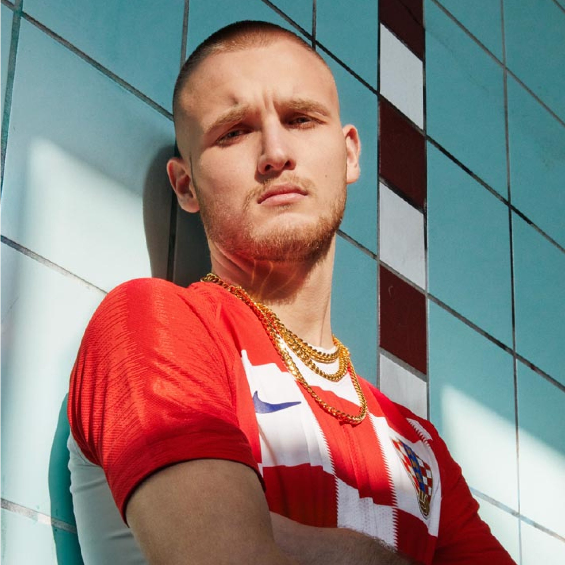
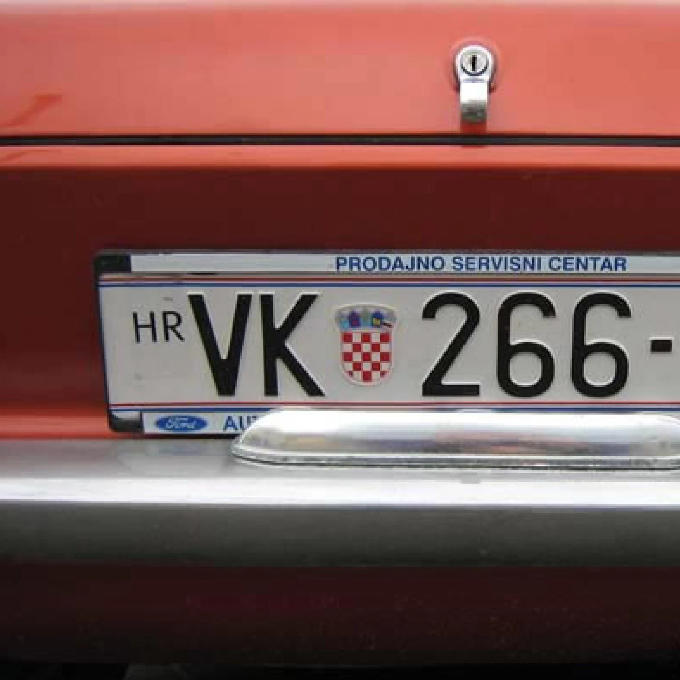
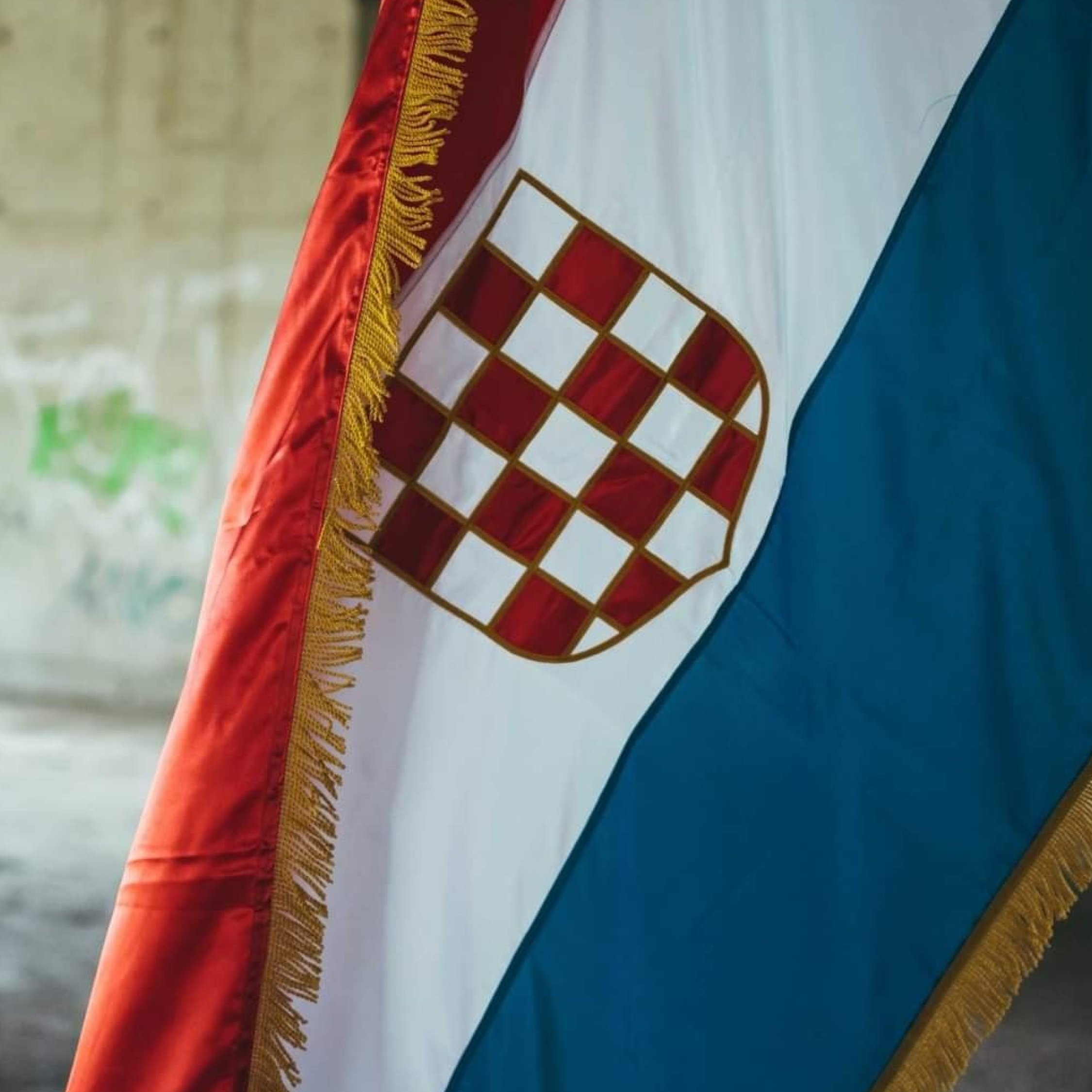
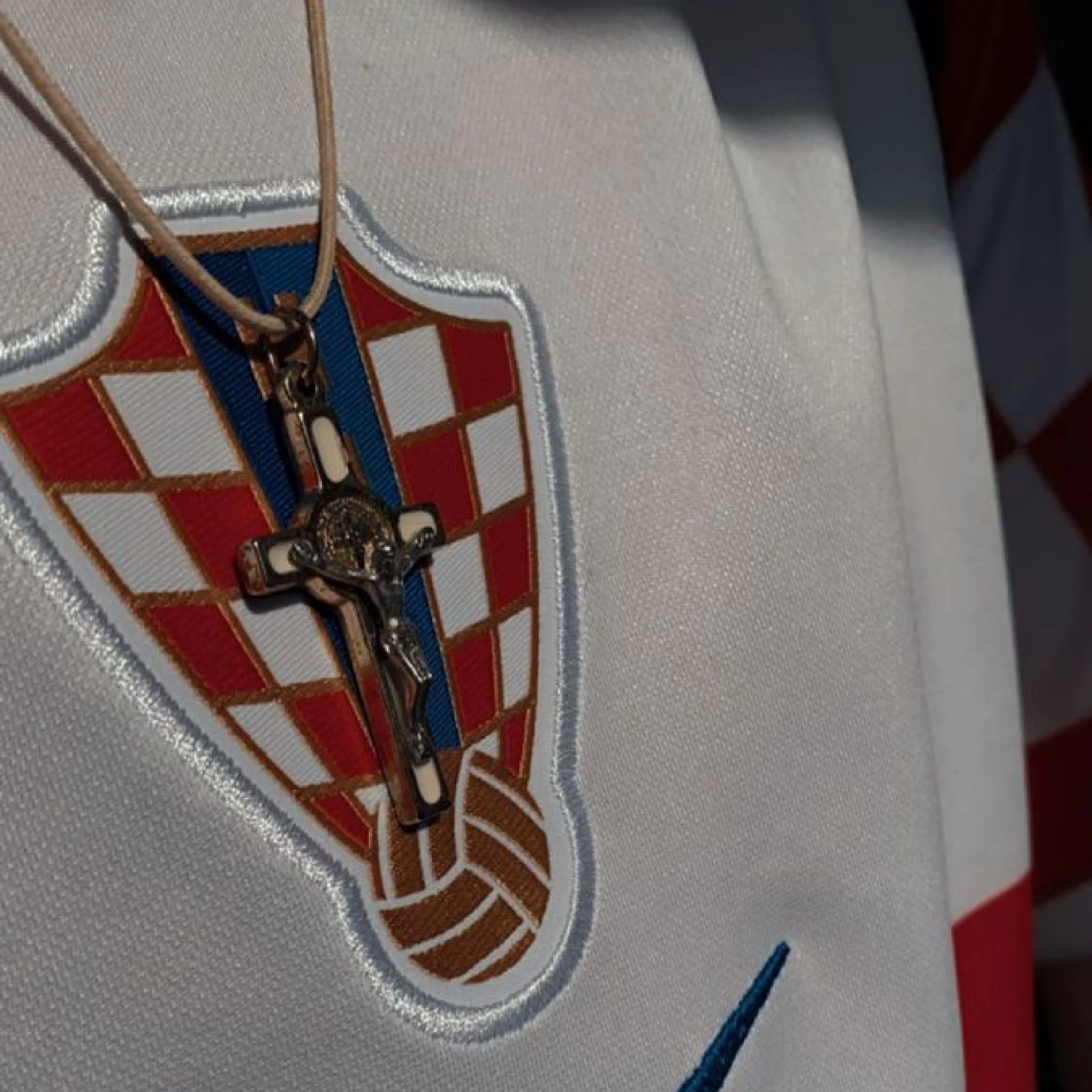
Once I clocked it, I couldn't stop seeing it. Flags above historic buildings, council logos, number plates, postage stamps, souvenir shops, sports kits. It was everywhere, and not in a forced, over-branded kind of way. It just belonged there. Completely woven into the fabric of everyday life. As a designer, it got me thinking.


The Origins
The checkerboard, known in Croatia as the šahovnica, meaning chessboard, sits at the centre of the Croatian coat of arms and has done for centuries. Where exactly it came from is still debated, but the story most people know involves King Stephen Držislav, who was captured by the Venetian Doge and offered a chance to win back his freedom over a game of chess. He won. And somewhere along the way, the pattern became his, and eventually the nation's. Myth or history, it doesn't really matter. The story stuck, and so did the symbol. That's usually how the best ones work.
A Masterclass in Consistency
What genuinely impressed me wasn't just the symbol itself, it was how consistently it was used. Lots of countries have official emblems. Few manage to integrate them so naturally across every corner of public life.
The checkerboard functions almost like a master brand. Government buildings, tourism materials, sporting events, public services, the same simple device running through all of it. Creating recognition, familiarity, and a quiet sense of national pride without ever feeling overdone.
As designers, we're always chasing that combination. Something flexible enough to work anywhere, simple enough to be remembered, meaningful enough to last. Croatia's checkerboard has been doing exactly that for centuries.
What Travel Teaches You About Design
The best design lessons don't always come from galleries or studios. Sometimes they're hiding in plain sight in the details that locals walk past without a second glance.
This was one of those moments. A simple observation on holiday that turned into a proper reminder of what a strong visual identity actually looks like. Not always the most complex thing in the room. Usually the one that's been there the longest and shows no signs of going anywhere.
Working on a brand project?
If you're looking to build or evolve your brand identity, I'm currently taking on new projects. Get in touch through the contact page. I'd love to hear what you're working on.