SoundCHK Brand Identity: Designing a Logo With Meaning
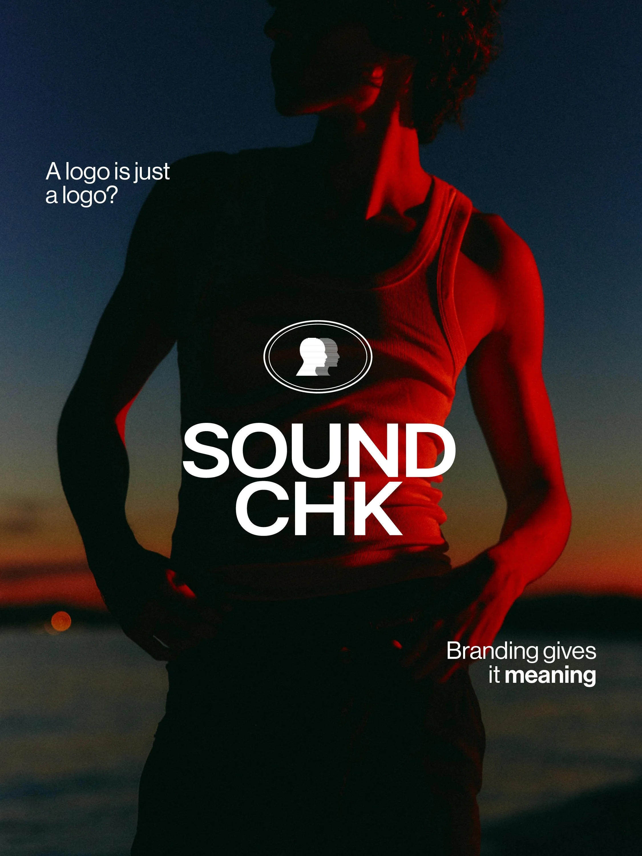
A logo can be distinctive, memorable and visually striking, but what gives it meaning?
For SoundCHK, the answer came from looking beyond the logo itself and understanding what the brand represents. Created for a structured vocal training and artist development programme supporting both professional and emerging performers, the identity needed to balance discipline and creativity, technical development and personal expression.
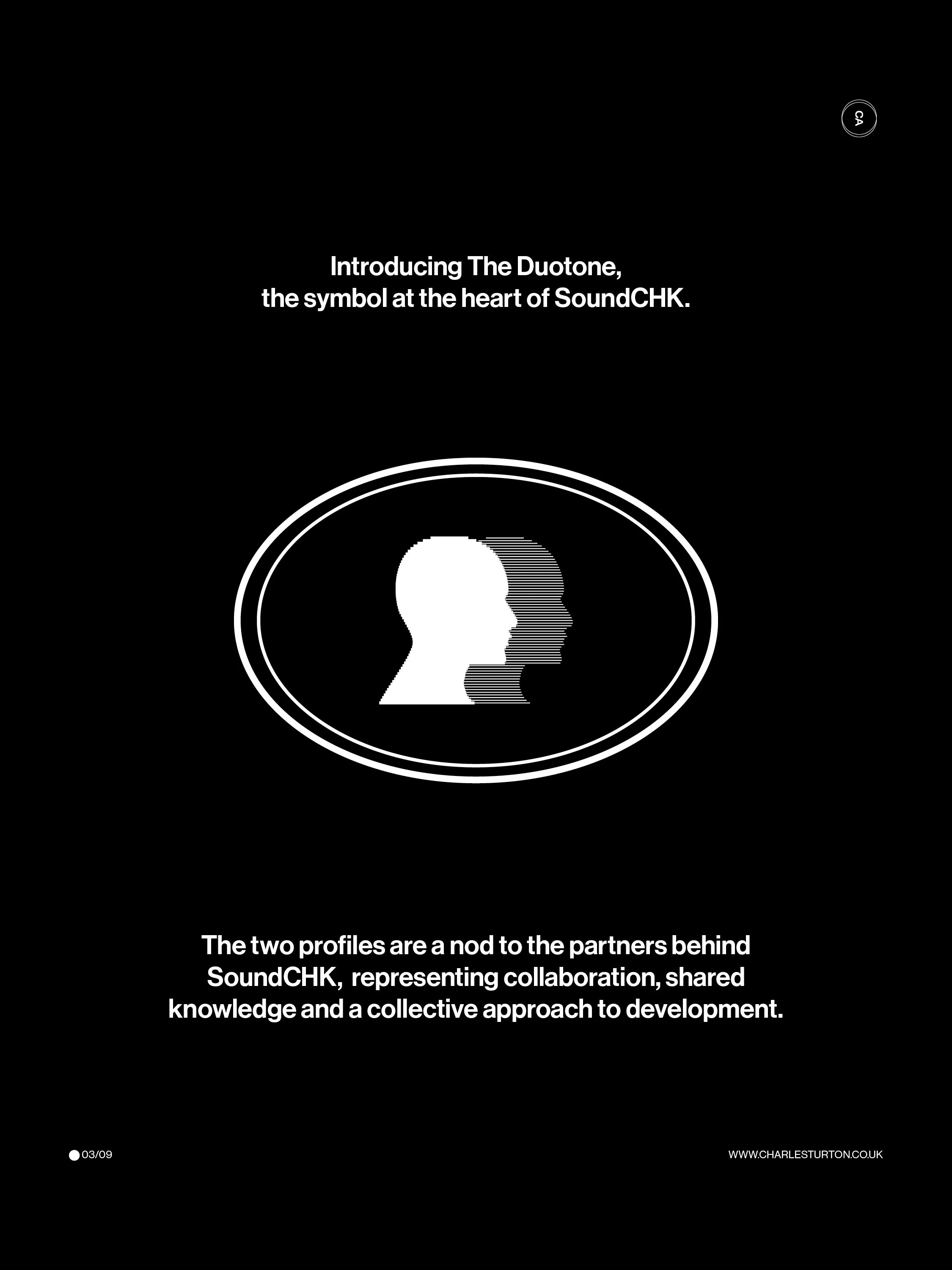
The result is a visual identity built around The Duotone, a symbol that represents the people behind SoundCHK, the performers within its community and the ongoing journey of developing your voice.
More than a logo
When developing an identity, the logo is often the most visible part of the brand. But a strong identity needs to work harder than simply looking good. For SoundCHK, the starting point was the idea of duality. The core symbol features two mirrored profiles, creating a distinctive and recognisable mark. At one level, the two heads represent the two partners behind SoundCHK, reflecting collaboration, shared knowledge and a collective vision.
But the meaning goes further. The multiple profiles can also represent the different versions of yourself that emerge throughout the development of a performer — who you are when you begin, who you become through training and the person you have the potential to be. The mark therefore becomes a visual representation of progression, community and personal development.
Making sound visual
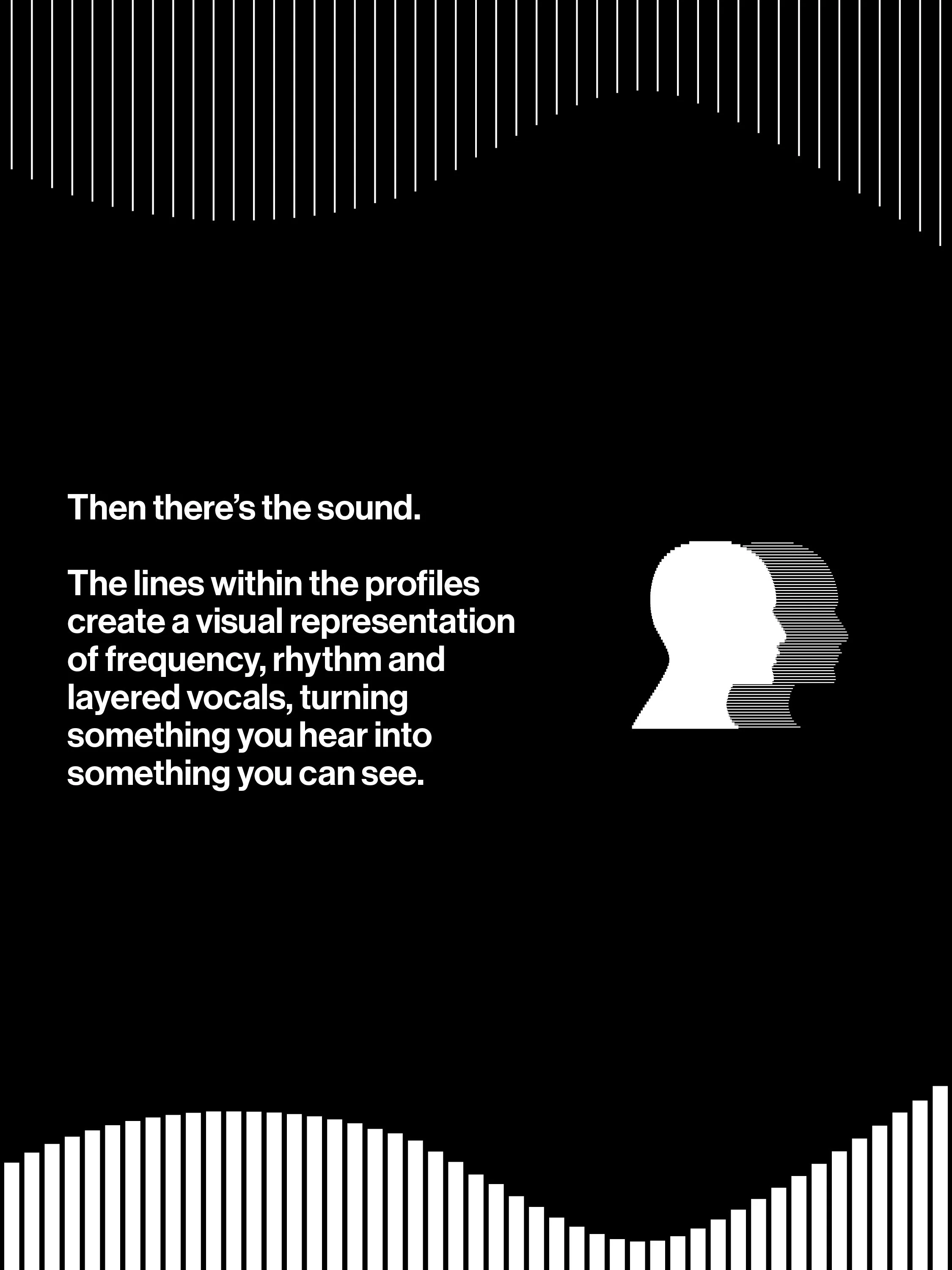
The linework within the profiles introduces another layer to the symbol. Inspired by the visual language of audio, the lines create a connection to frequency, rhythm, layering and the movement of sound. They bring a technical quality to the otherwise human form, reflecting the balance between the artistry of performance and the structured nature of vocal training.
This linework also became the foundation for the Signal Weave, a wider brand pattern developed from the details within The Duotone. Rather than introducing a completely separate graphic device, the pattern allows an element already embedded within the logo to become part of the wider identity.
Building the visual world
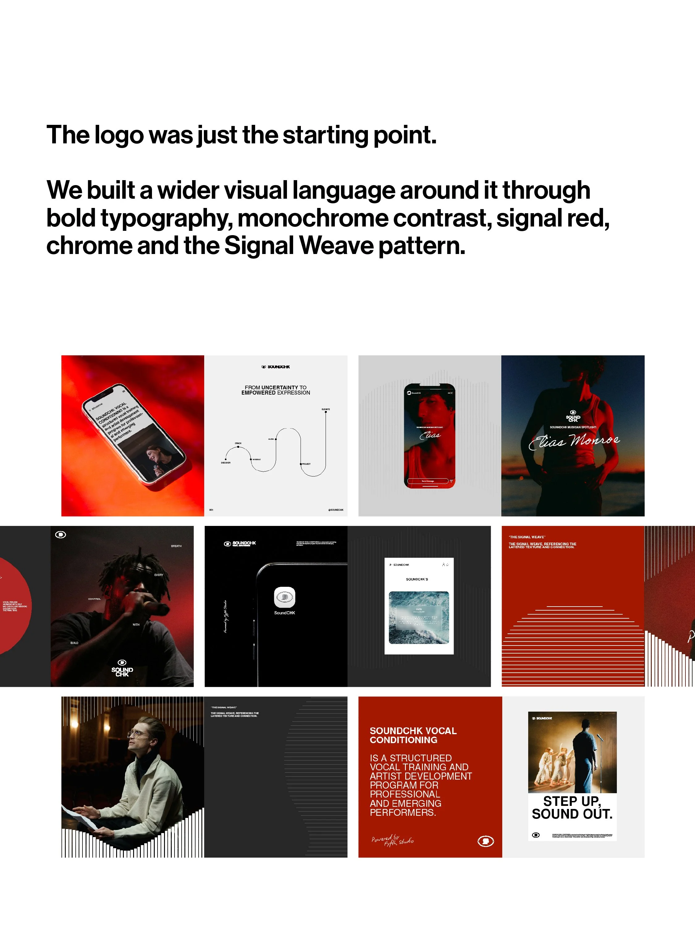
The Duotone was only the beginning. The wider SoundCHK identity was developed around a bold typographic system, a refined monochrome palette, signal red and chrome accents. Together, these elements create a visual language that feels focused, expressive and contemporary.
Nimbus Sans L provides the primary typographic foundation, using its bold weight for headlines and regular weight for supporting copy. Biro Script introduces a more human and playful element, particularly when highlighting artist names or adding a more expressive secondary layer.
The contrast between the two typefaces reflects the balance at the heart of SoundCHK, structured training alongside individuality and creative expression.
A system designed to evolve
The identity needed to work beyond a single logo lockup. The Duotone can operate independently as a recognisable symbol, while the wider system adapts across digital, print and physical applications. The Signal Weave adds texture and movement, while the chrome version of the icon introduces a more polished, elevated expression for digital applications. This creates a visual identity that can grow with the brand rather than being restricted to one fixed application.
Designing with intention
Ultimately, the SoundCHK identity isn’t just about creating a logo that looks distinctive. Every element has a role within the wider story, from the two profiles and their connection to community and personal growth, to the sound-inspired linework, typography, colour and supporting pattern.
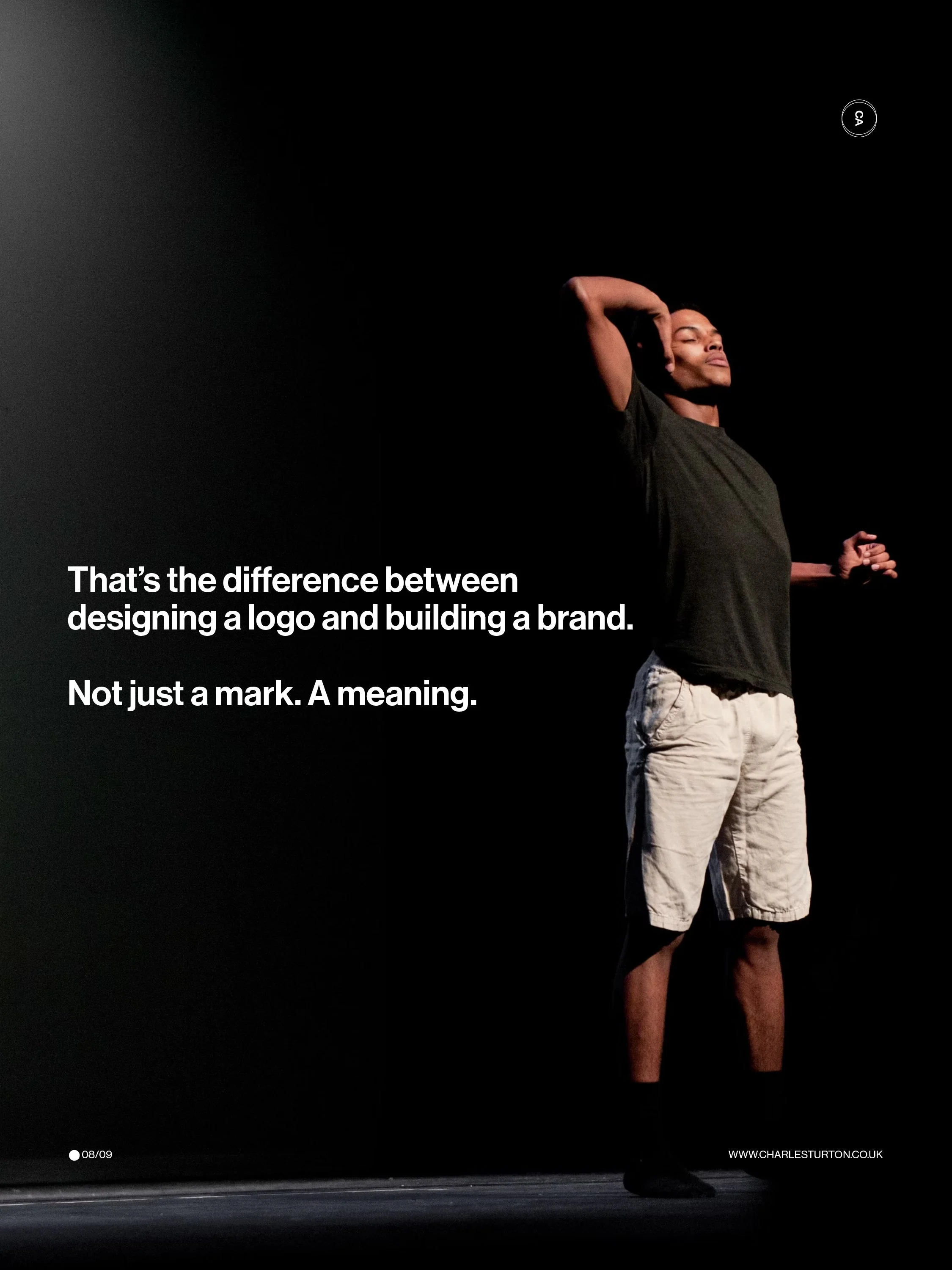
The result is an identity that connects back to the people behind SoundCHK, the performers developing within it and the voices they’re learning to own. That’s the difference between designing a logo and building a brand. Not just a mark, but meaning.