I was in Miami for Adobe MAX 26, with a little time before the event began, when I came across the Vice City takeover for GTA VI. I don’t own a console, so I haven’t played the game, but seeing its world spill into the real city built up my excitement. By the end of the trip, I was thinking I might have to go out and buy it.
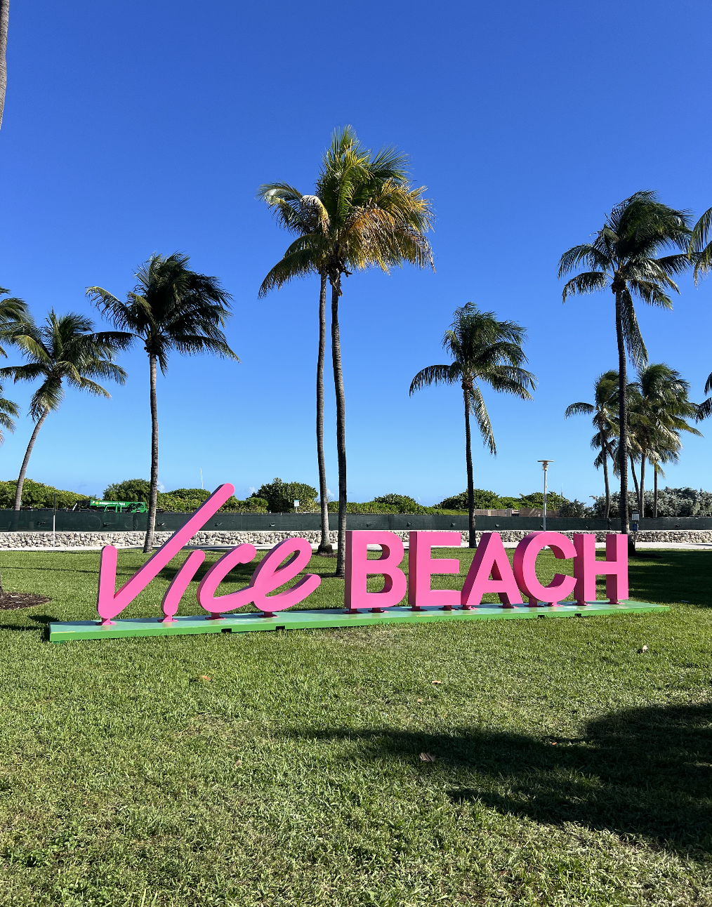
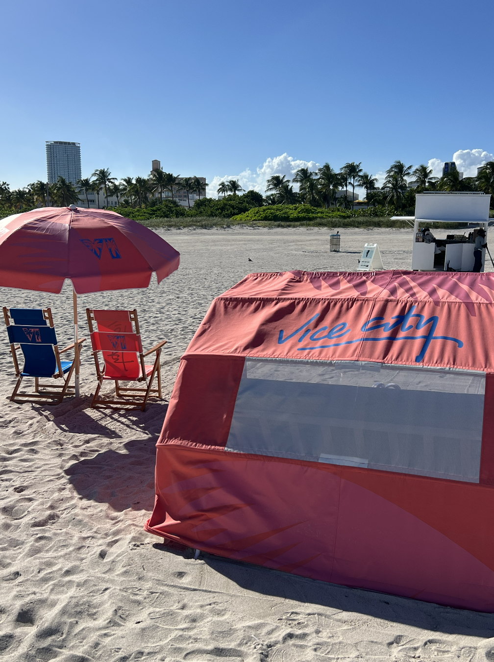
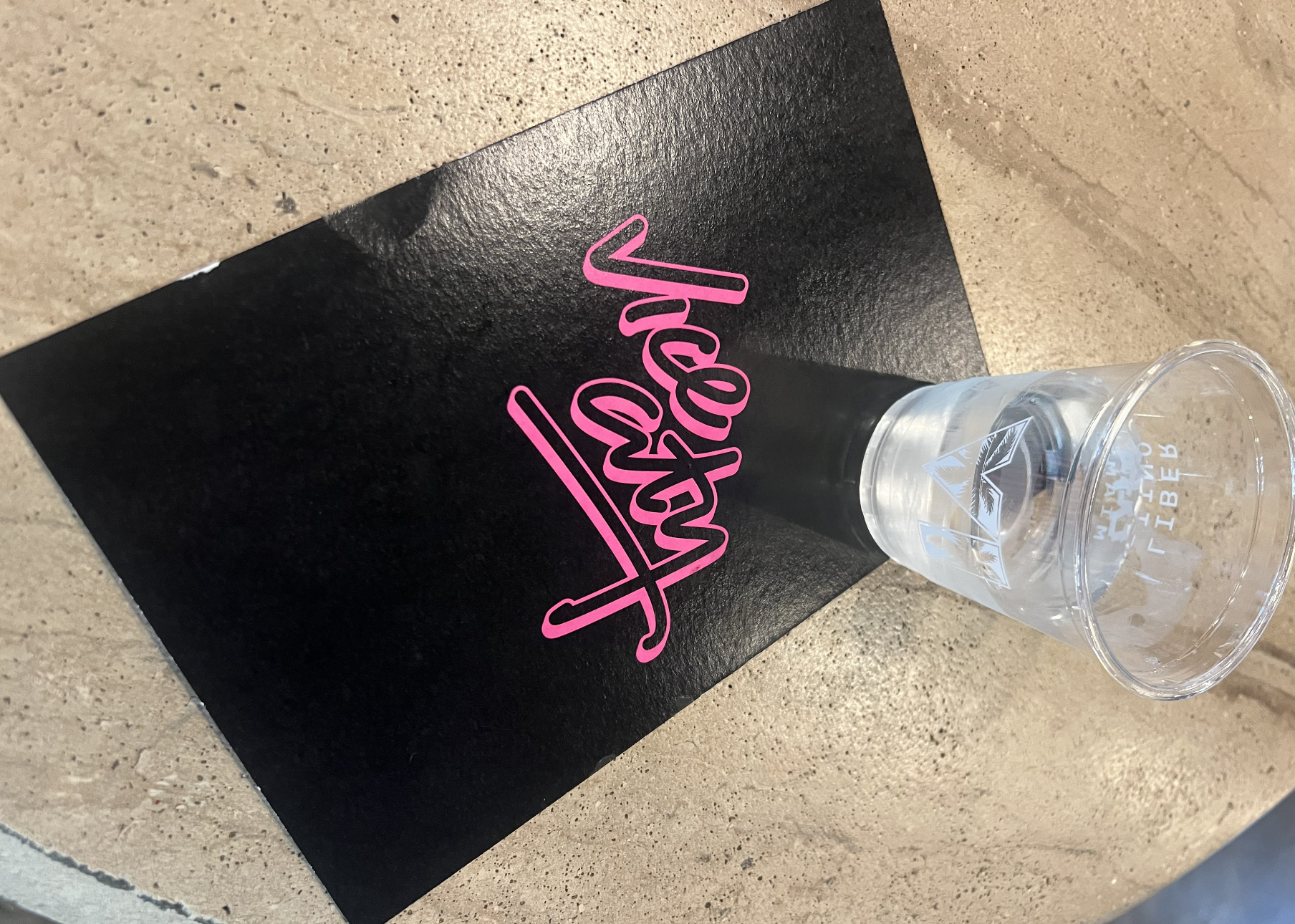
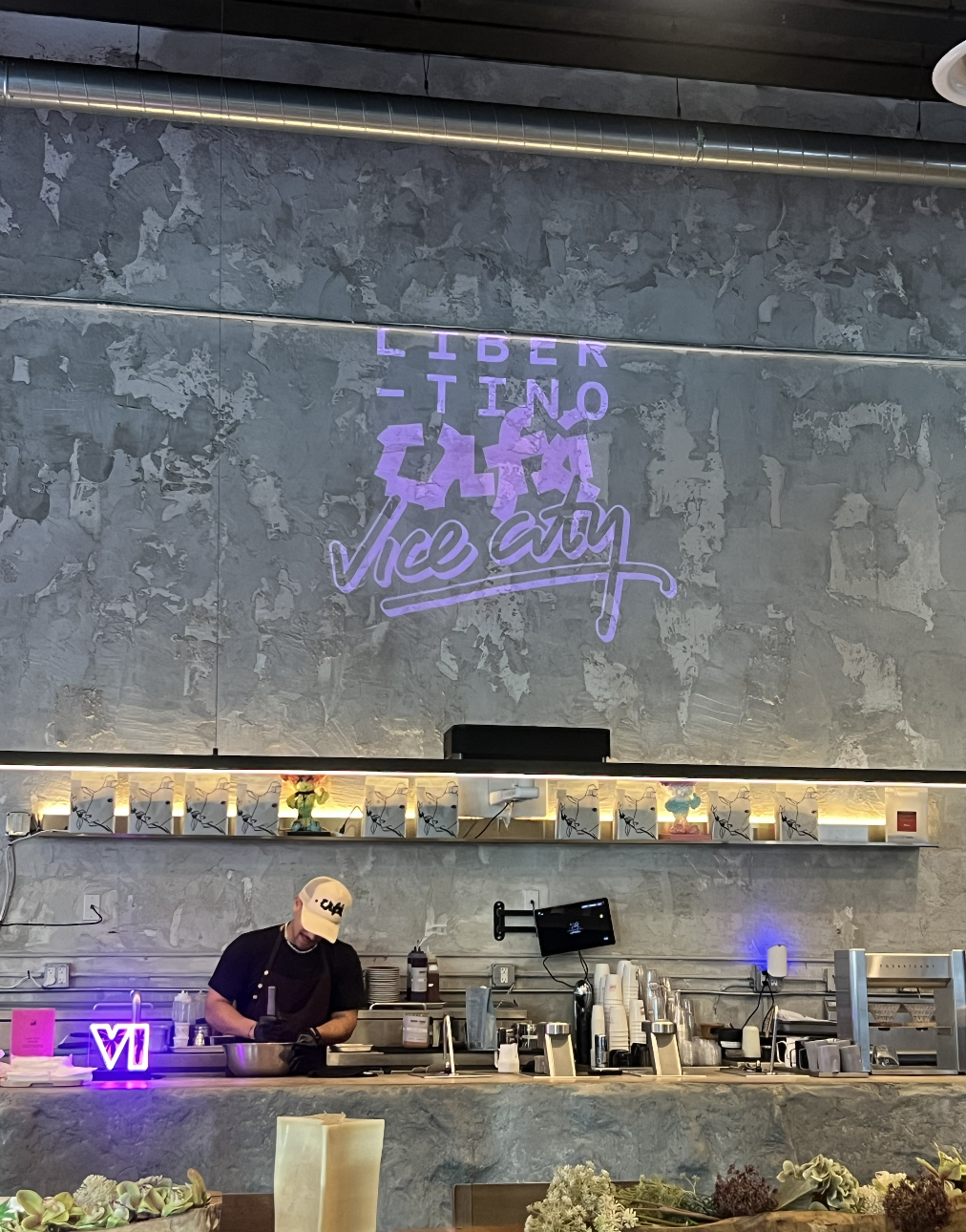
Some of the most memorable details were the fictional restaurants from the game brought to life at the Miami Heat arena: Burger Shot and Cluckin’ Bell. Cafés, bars and restaurants around the city were also serving limited-edition Vice City drinks and food. I don’t know whether any of those participating venues will appear in the game, but that would be a fun connection between the real city and the fictional one.
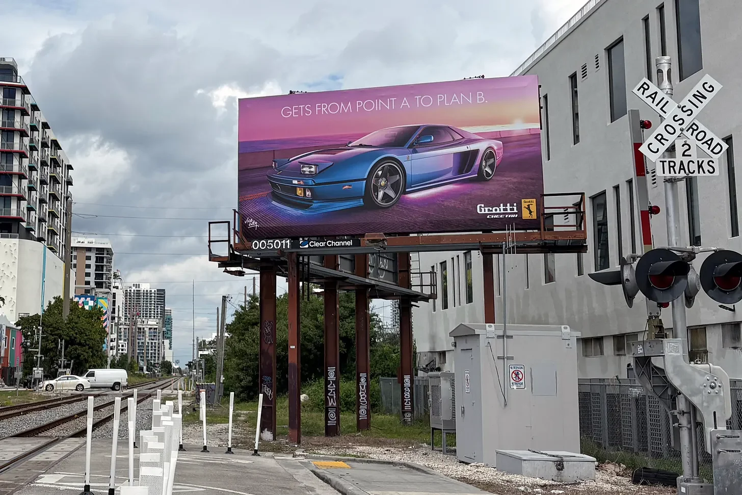
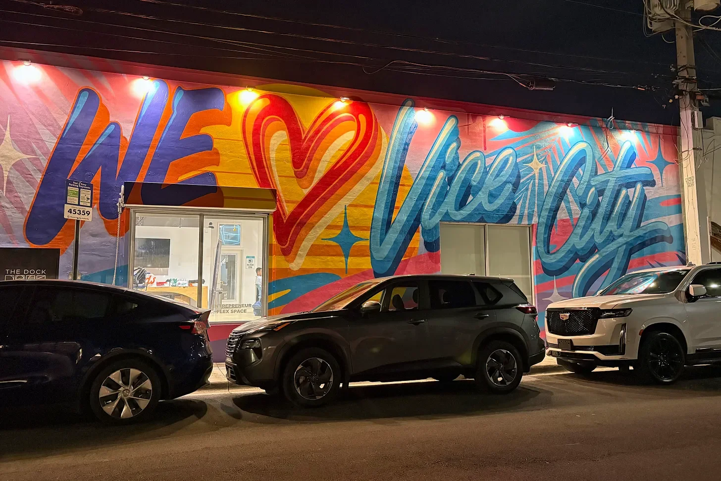
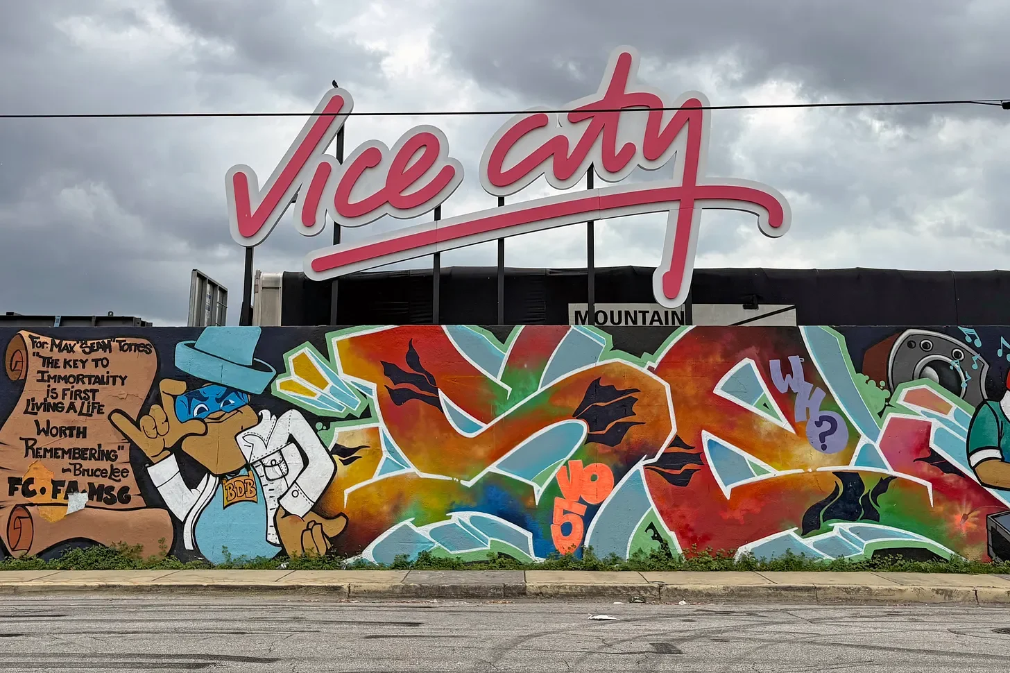
Wynwood, with its strong arts scene, was a natural place for the murals. I also spotted promotional signage for Vice City clubs, and even planes flying overhead with Vice City messaging. The whole campaign felt like it had found its way into the everyday life of Miami.
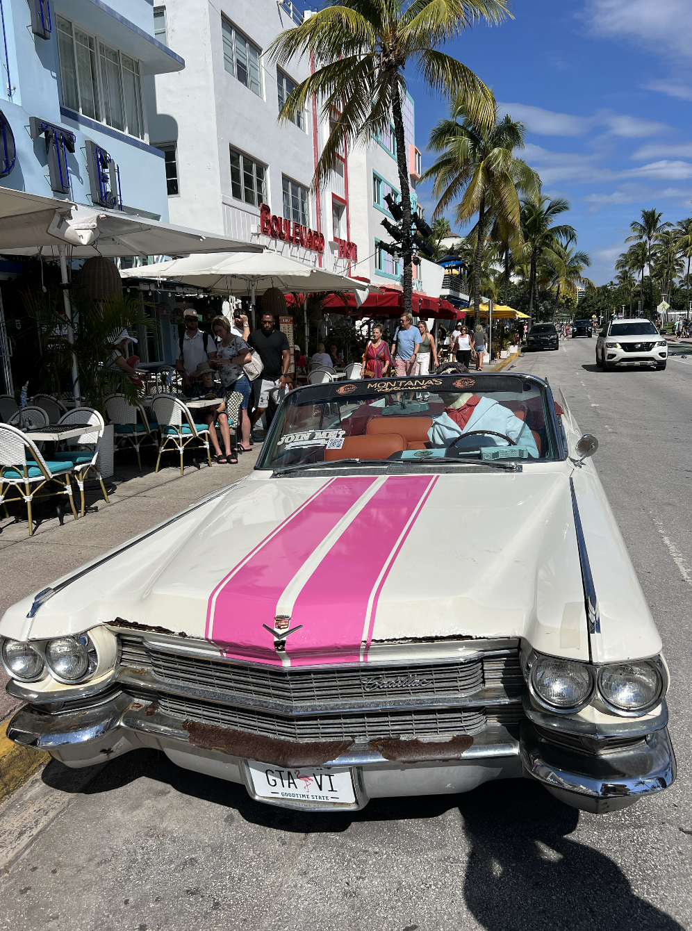
Then there was the car. I’d gone out to pick up a pizza when I heard the familiar GTA horn. I turned around and saw a green lowrider drive by, with neon underglow, immaculate paintwork and a group of friends riding along. It was one of those moments that made the fictional world feel suddenly real.
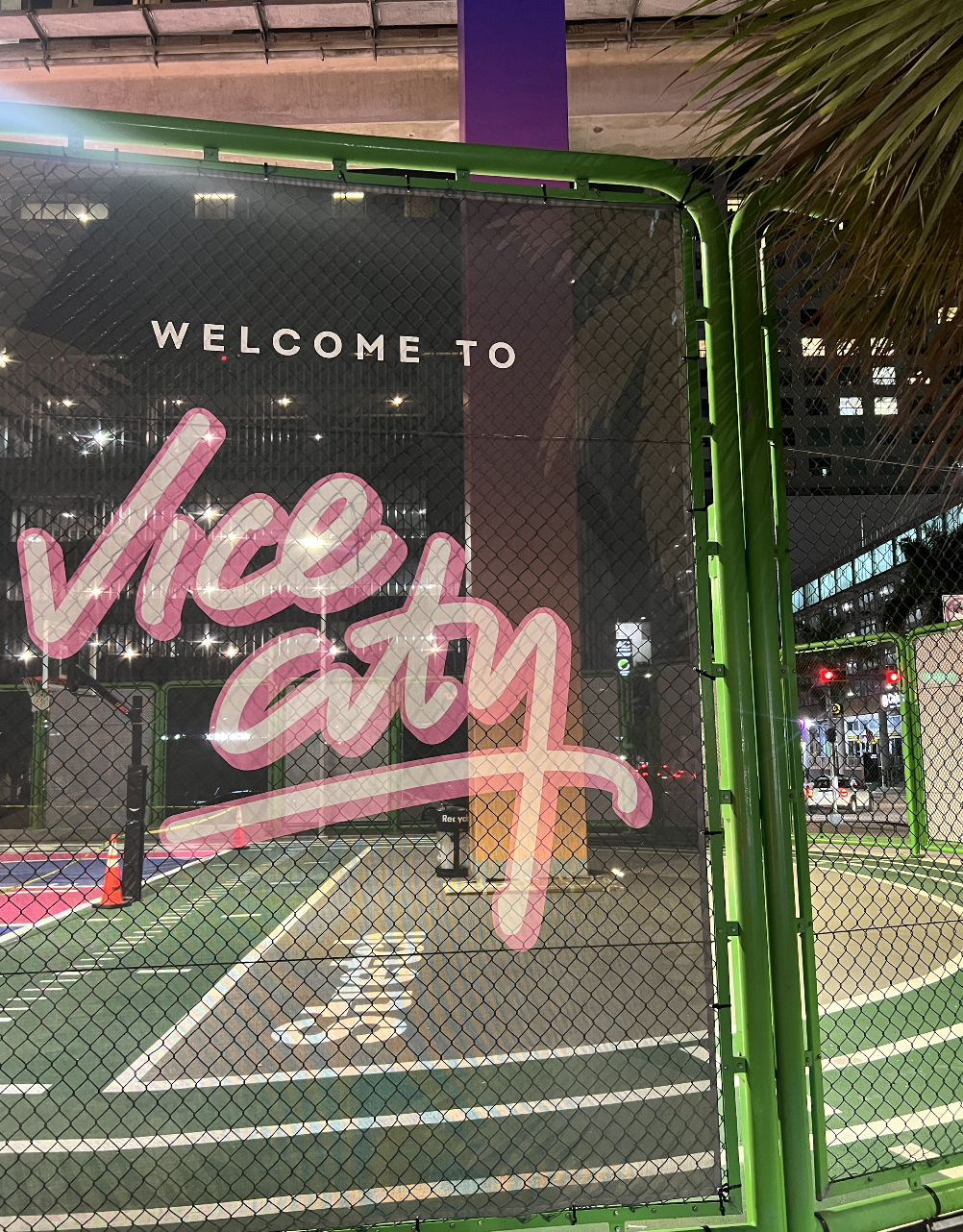
As a brand designer, I was inspired by how consistently the identity showed up across all these different places and experiences. The colours really popped and suited Miami: hot pink, neon shades and a palette that felt right for the city. The logo system was instantly recognisable, whether it used the full “Vice City” name or the “VI” lockup with palm trees. If you knew, you knew.
That consistency is what made the scale work. The same identity could appear on a mural, a restaurant activation, a drink, a plane or a car, and still feel like part of one campaign. The colour pink became shorthand for Vice City. It reminded me how a strong colour choice can come to define a whole brand moment, much like orange did for Marty Supreme.
The campaign also made me think about the relationship between a brand and the place it enters. Vice City is based on Miami, and the takeover drew on the city’s own colour, light and character. The setting didn’t feel like a backdrop; it felt like part of the experience.
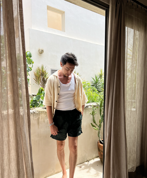
Some images are by Sue Bing
For me, that’s what makes this such a strong example of branding: a clear identity, applied consistently and in a way that connects with its surroundings. It inspired me to think about how I build distinctive, flexible brand worlds in my own work, especially across fashion, sport and music.
I’m currently available for branding projects and design support. If you’re developing a brand, launch or campaign and could use a creative partner, get in touch.